Mind Aid Therapy App
Designing a new, inclusive way to access therapy
Mind Aid Therapy App
Designing a new, inclusive way to access therapy

Overview
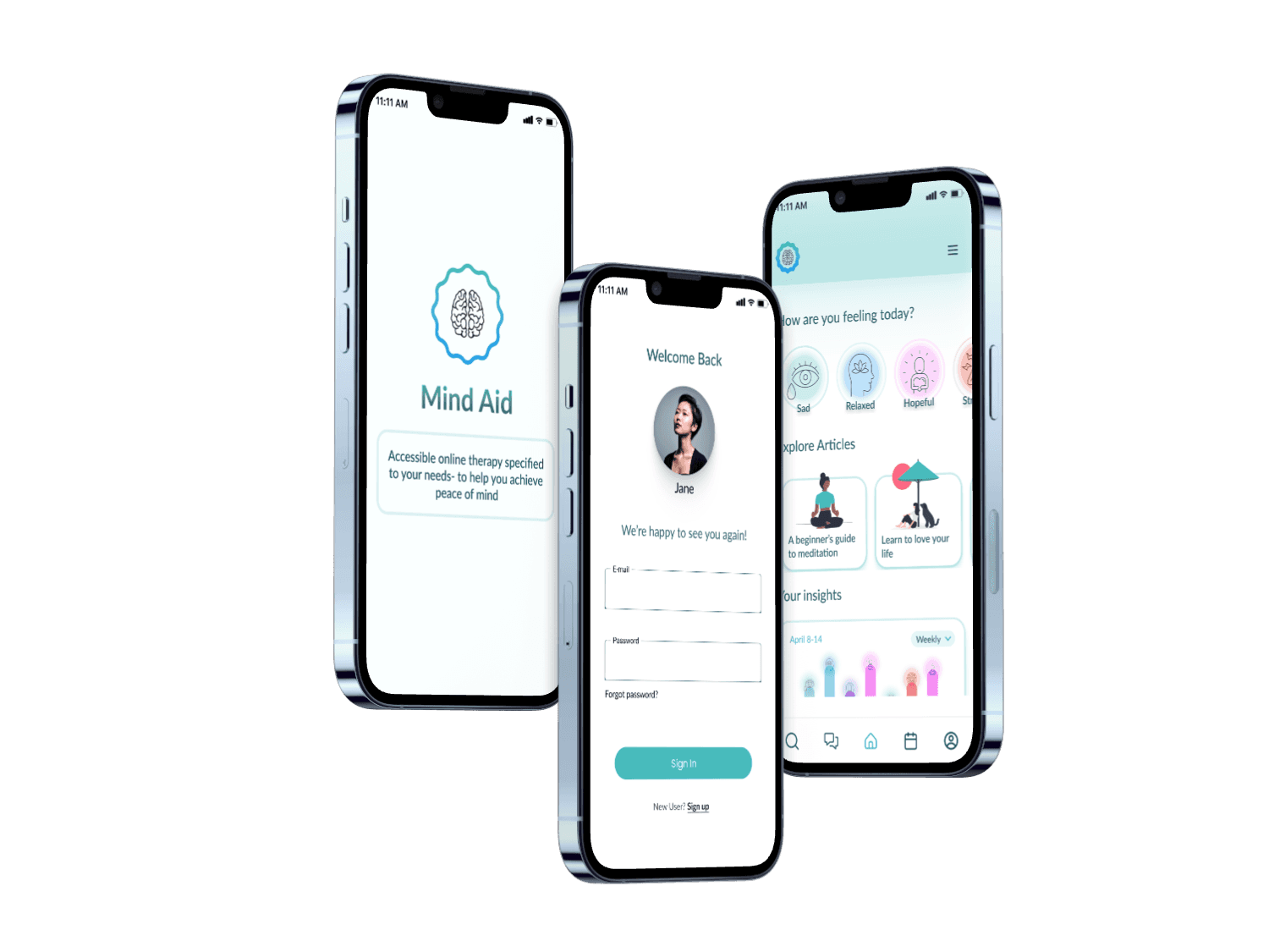
The stigma around mental health is fading, and therapy apps have become widespread. However, many of these platforms remain out of reach for marginalized communities due to high costs and limited accessibility. Driven by a passion for social impact, I set out to design an app that prioritizes affordability and trust. This platform helps users connect with therapists they can rely on while allowing them to filter options based on their budget.
My Role: Sole UX/UI Designer
Duration: 6 months
Tools Used: Figma, Miro, InVision, Adobe Illustrator, Maze
Challenge
Many therapy apps fail to make mental health care truly accessible, often overlooking affordability and meaningful therapist-client connections.
Solution
To break these barriers, we need to rethink how we ask questions during the matching process to ensure users are paired with therapists who not only fit their financial situation but also align with their specific emotional needs and preferences.
Goal
To design a user-centered therapy app that ensures users are matched with therapists who fit both their budget and emotional needs, based on personalized recommendations generated from their responses to the initial assessment.
Goal
To design a user-centered therapy app that ensures users are matched with therapists who fit both their budget and emotional needs, based on personalized recommendations generated from their responses to the initial assessment.
Challenge
Many therapy apps fail to make mental health care truly accessible, often overlooking affordability and meaningful therapist-client connections.
Solution
To break these barriers, we need to rethink how we ask questions during the matching process to ensure users are paired with therapists who not only fit their financial situation but also align with their specific emotional needs and preferences.
To design a user-centered therapy app that ensures users are matched with therapists who fit both their budget and emotional needs, based on personalized recommendations generated from their responses to the initial assessment.
Lack of personalized therapist matching based on user preferences.
Affordability options are limited, with little transparency on pricing and payment flexibility.
Current platforms offer insufficient support for cultural competence and diversity in therapist options.
Understand
Existing apps feel too impersonal
Understand
Existing apps feel too impersonal
The journey began with a competitive analysis of online therapy apps, focusing on Talkspace and Wysa. This process revealed key insights on user trust, therapist matching, and the need for affordable options when searching for therapists. By examining competitors and analyzing market trends, I have outlined my key findings:
The journey began with a competitive analysis of online therapy apps, focusing on Talkspace and Wysa. This process revealed key insights on user trust, therapist matching, and the need for affordable options when searching for therapists. By examining competitors and analyzing market trends, I have outlined my key findings:
Lack of personalized therapist matching based on user preferences.
Affordability options are limited, with little transparency on pricing and payment flexibility.
Current platforms offer insufficient support for cultural competence and diversity in therapist options.
Surrendering my own biases
The beauty of user interviews lies in how they push us, as designers, to explore ideas we might not have considered on our own. While we may think we have all the answers from our own research, there’s nothing more humbling than realizing the importance of user feedback. Conducting surveys and interviews is essential for creating a truly user-centered product that addresses real needs.
Affinity Mapping Based on User Interviews
Affinity Mapping Based on
User Interviews


Additional takeaways after conducting interviews and affinity mapping based on results
Additional takeaways after conducting
interviews and affinity mapping
based on results
Users would like tools that allow them to monitor their progress throughout their therapy journey.
Users would like tools that allow them to monitor their progress throughout their therapy journey.
Privacy ranked top of mind for most of the users- something I thought of when questioning, but it took a front seat after seeing results.
Privacy ranked top of mind for most of the users- something I thought of when questioning, but it took a front seat after seeing results.
Users do not want to commit to subscription pricing model and do not want to be deterred by unexpected costs.
Users do not want to commit to subscription pricing model and do not want to be deterred by unexpected costs.
Define
Meet Manuela & David
Define
Meet Manuela & David
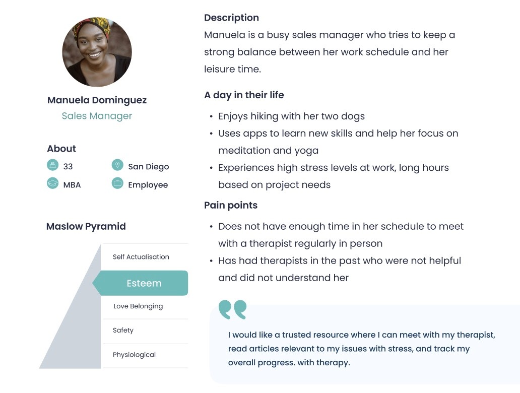
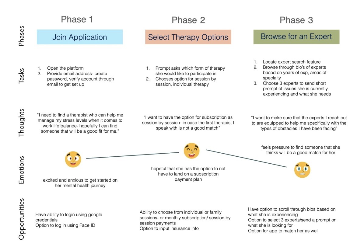
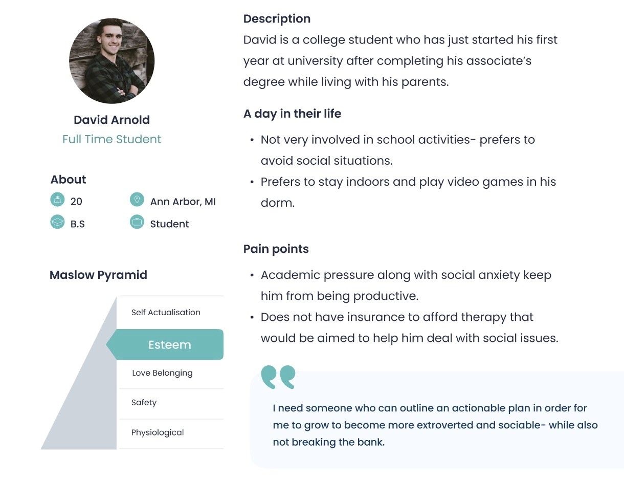
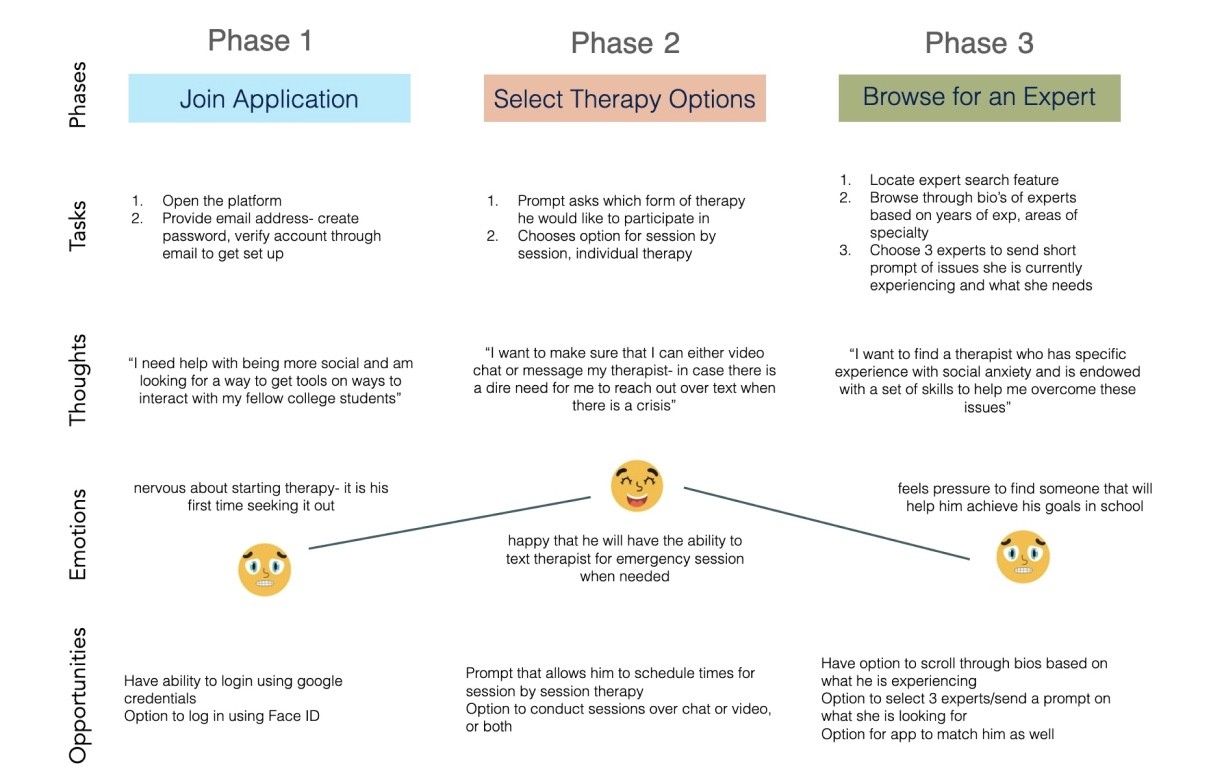
After analyzing in-depth interview results and going through the process of affinity mapping, I developed two distinct user personas: the student and the businessperson. While both user groups prioritize privacy and flexibility , their main motivations converge in making sure that therapy sessions were affordable and able to be moved around in case of any scheduling conflicts.
After analyzing in-depth interview results and going through the process of affinity mapping, I developed two distinct user personas: the student and the businessperson. While both user groups prioritize privacy and flexibility , their main motivations converge in making sure that therapy sessions were affordable and able to be moved around in case of any scheduling conflicts.
How we can help our users
To conclude my research, I came up with a few How Might We statements to focus on Manuela and David's pain points and how to incorporate the proper features throughout the application.
How Might We:
Reduce decision fatigue when selecting a therapist?
Make it easier for users to find therapists who match their personal values?
Increase transparency in pricing to eliminate unexpected costs?
Help users track their progress and understand impact of therapy?
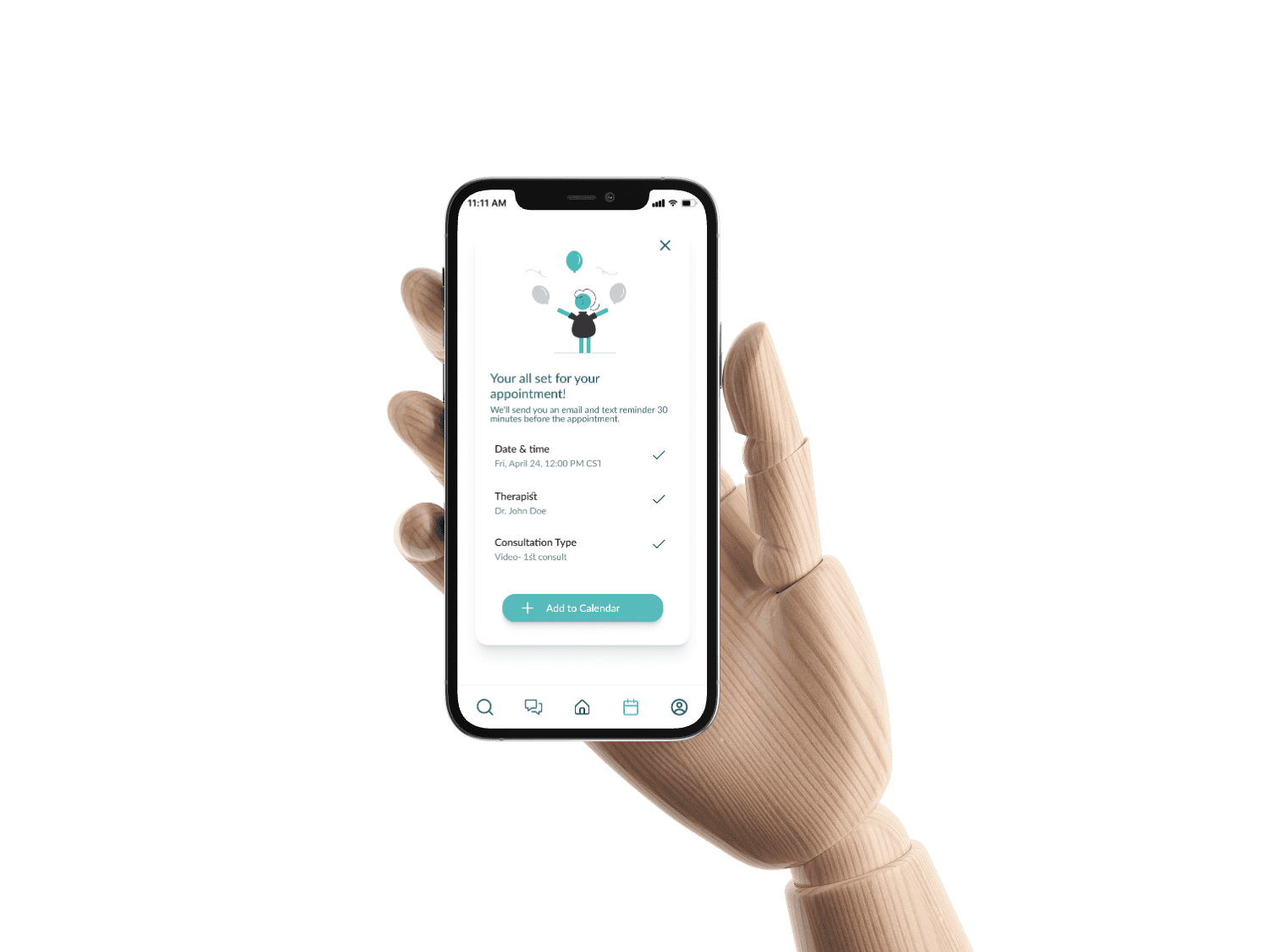

Completion of sign up assessment in order to get matched with a therapist based on my responses.
Completion of sign up assessment
in order to get matched with a
therapist based on my responses.
Customize search by filtering therapists based on preferences such as prize range, session type, or specialty.
Customize search by filtering therapists based on preferences such as prize range, session type, or specialty.
Book an appointment with a therapist directly through the app, selecting a convenient time slot that fits my schedule.
Book an appointment with a therapist directly through the app, selecting a convenient time slot that fits my schedule.
Develop
Identifying Key Features
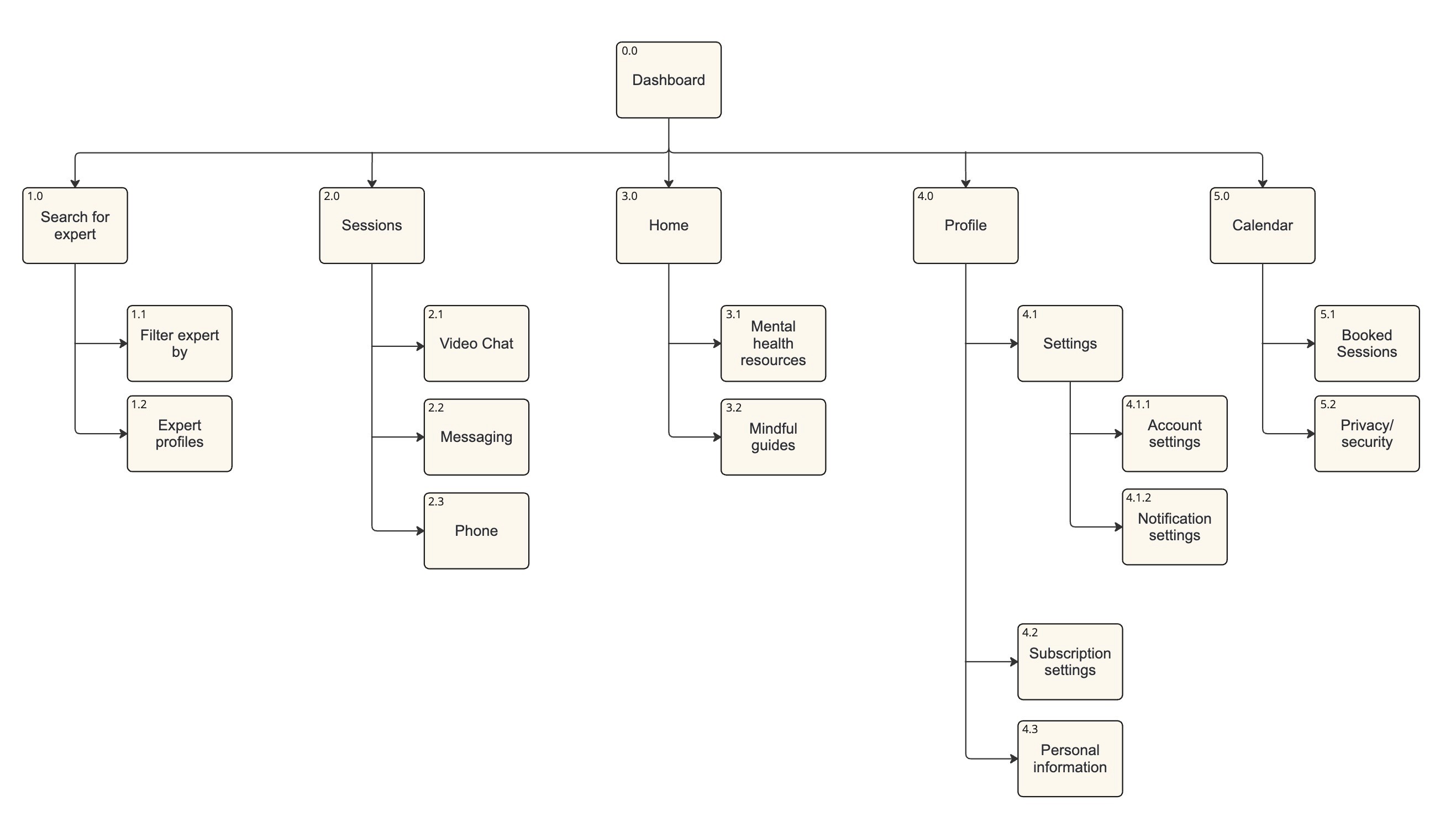
I needed to identify the needs of my users and think about how they will navigate Mind Aid to find the right therapist. I put together what would act as the Minimum Viable Product (MVP) by identifying these high-priority features to better help me understand how users would interact with the app.
As part of the design process, I wanted to make sure that the content would be intuitively placed within the app. I conducted a card sort, using Optimal Workshop, to help structure the therapist categories and ensure the search filters align with user expectations.
As part of the design process, I wanted to make sure that the content would be intuitively placed within the app. I conducted a card sort, using Optimal Workshop, to help structure the therapist categories and ensure the search filters align with user expectations.


It's all coming together
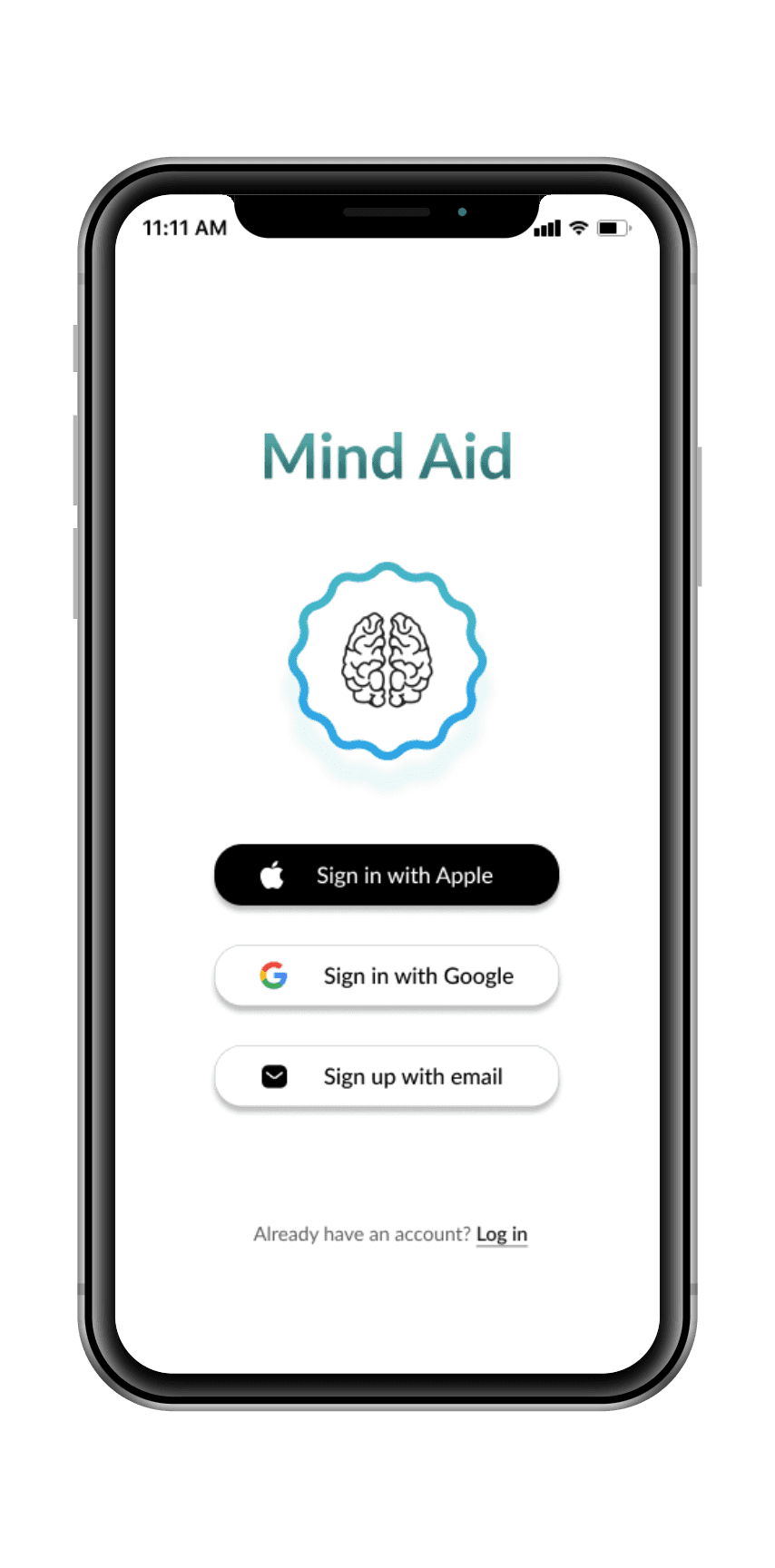
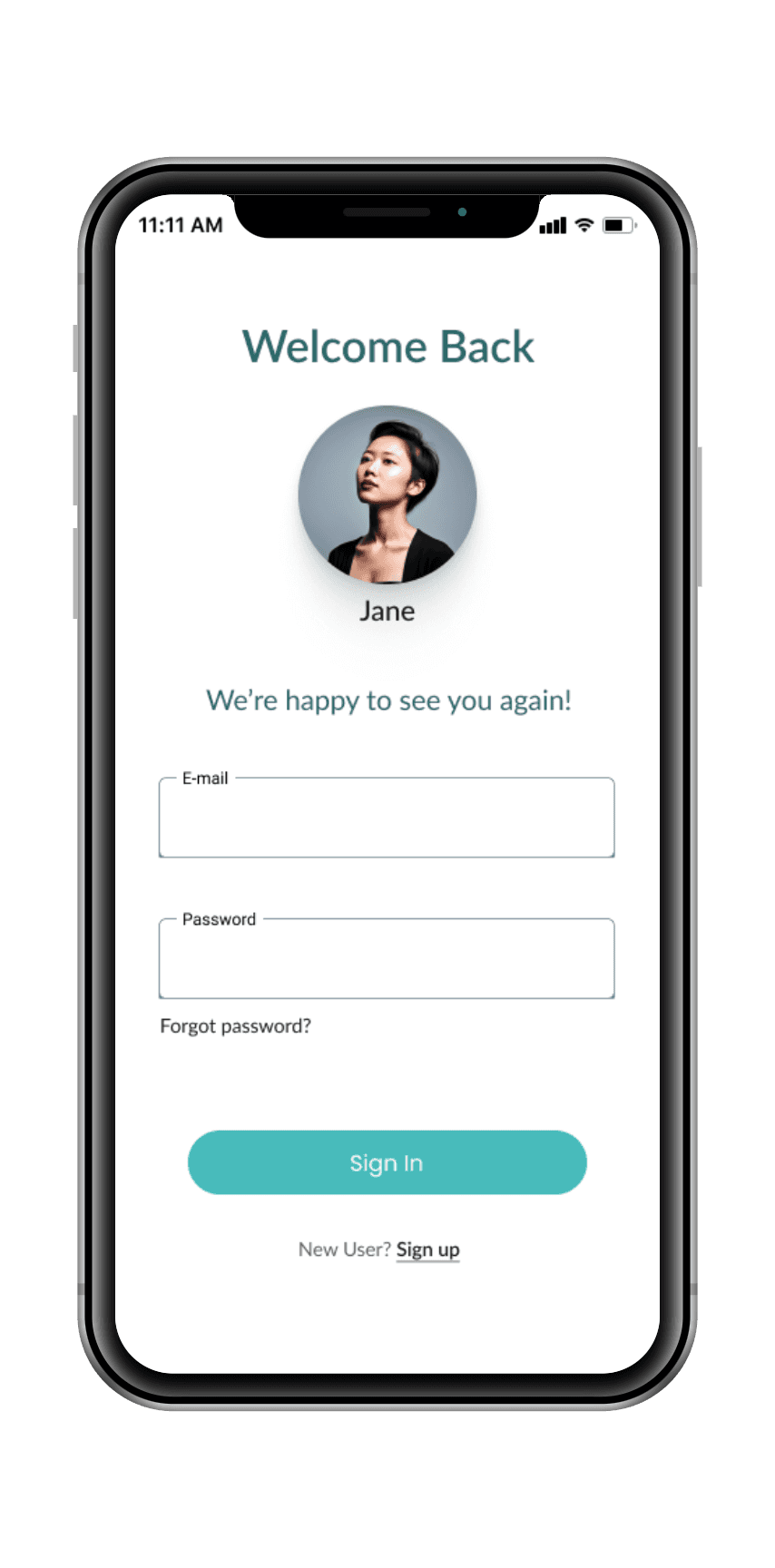
After careful consideration of all data compiled thus far- I turned my concept into reality by creating Low Fidelity Prototypes in Figma!
It's all coming together
After careful consideration of all data compiled thus far- I turned my concept into reality by creating Low Fidelity Prototypes in Figma!
MindAid
or
Log In
Sign Up
Sign Up w/ Google
Log In
Email
Password
Create Account
Email address
Name
Create Password
Continue
Skip
Assessment
Type of therapy you’re seeking
B
A
C
Articles
Progress Tracking

Home
New Features
Search
Messages
Home
Calendar
Profile

Search
Messages
Home
Calendar
Profile

Search
BIO
BIO
BIO

My Matches
Profile 1
Profile 2
Profile 3
BIO
BIO

Search
Messages
Home
Calendar
Profile
Therapist Name
bio of therapist- field of specialty, yrs exp, summary of treatments
Check Availability
Send Message
Therapist Name
Times Available

Search
Messages
Home
Calendar
Profile
Booking Date
Meeting Type:
Set Reminder:
45 min
15 min
30 min

April 24, 2023
12:30 PM


Search
Messages
Home
Calendar
Profile
Confirm Session
Meeting Type:
Set Reminder:


April 24, 2023
12:30 PM
15 min
Confirm Session
Search
Messages
Home
Calendar
Profile
Booking Confirmation
Meeting Type:
Set Reminder:

April 24, 2023
12:30 PM
15 min
+ Calendar
Done
X
Therapist Name


Add to:
Search
Messages
Home
Calendar
Profile
Deliver
Design System
Deliver
Design System
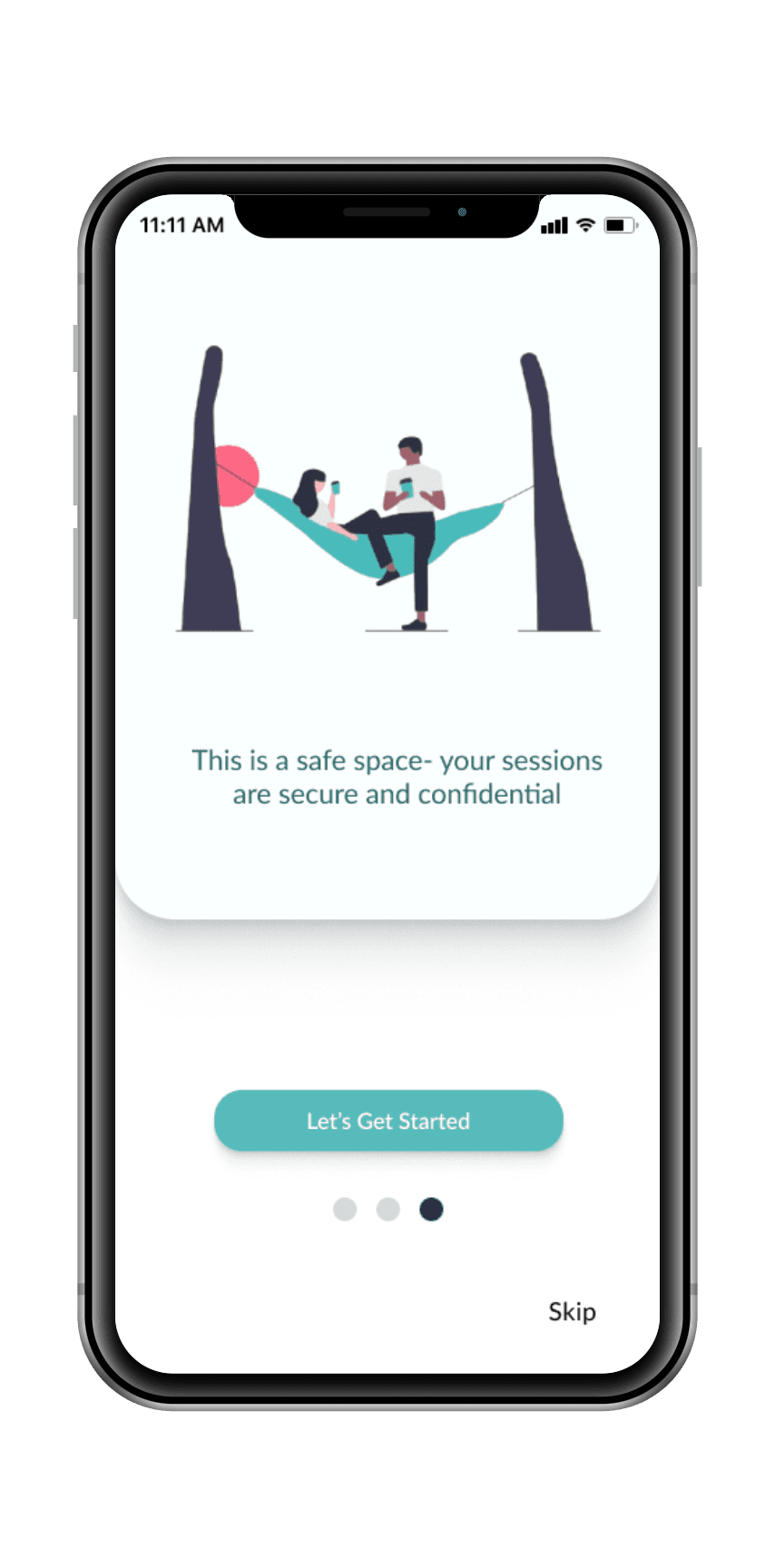
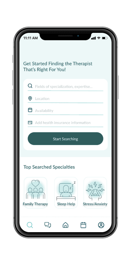
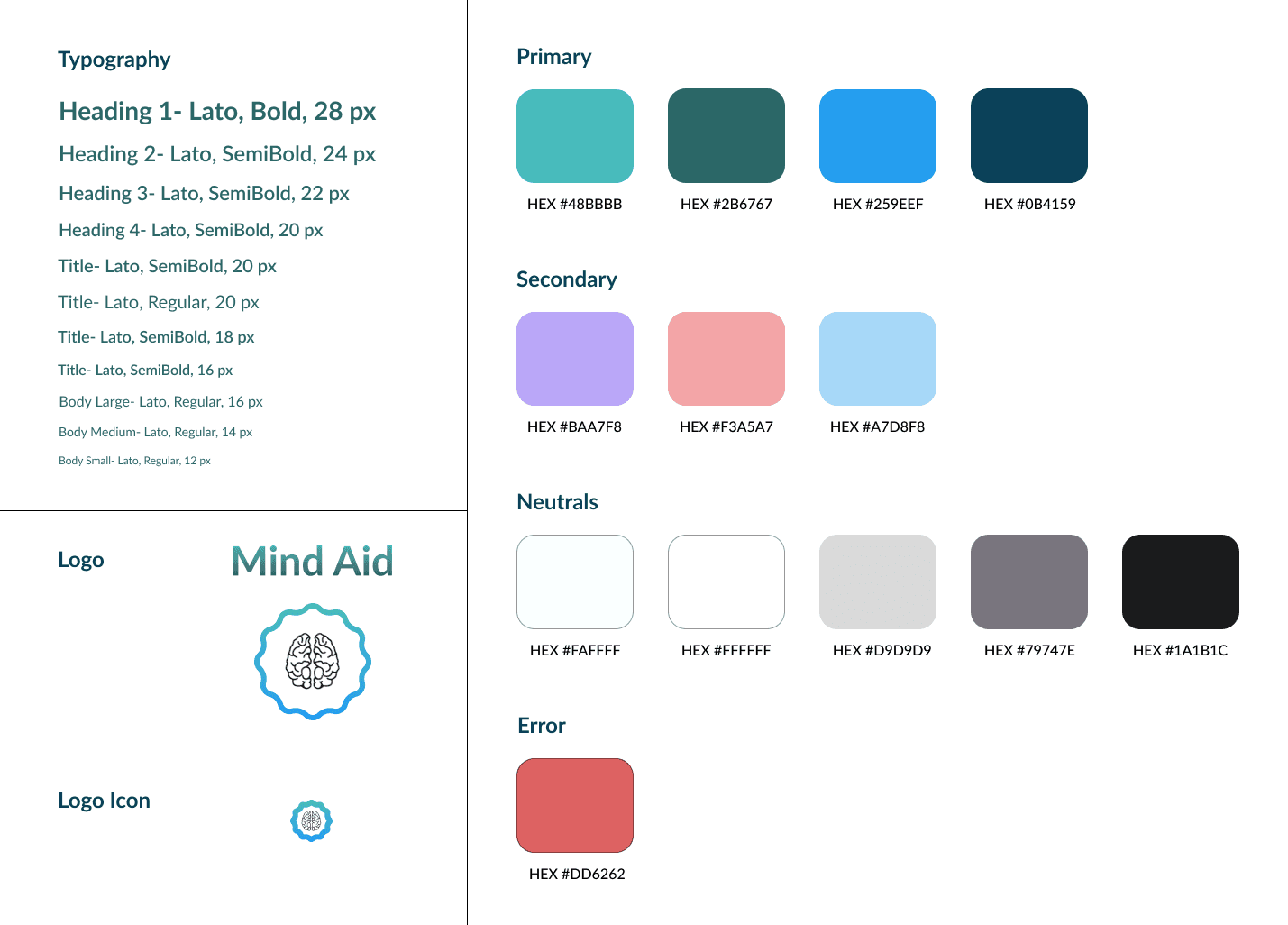
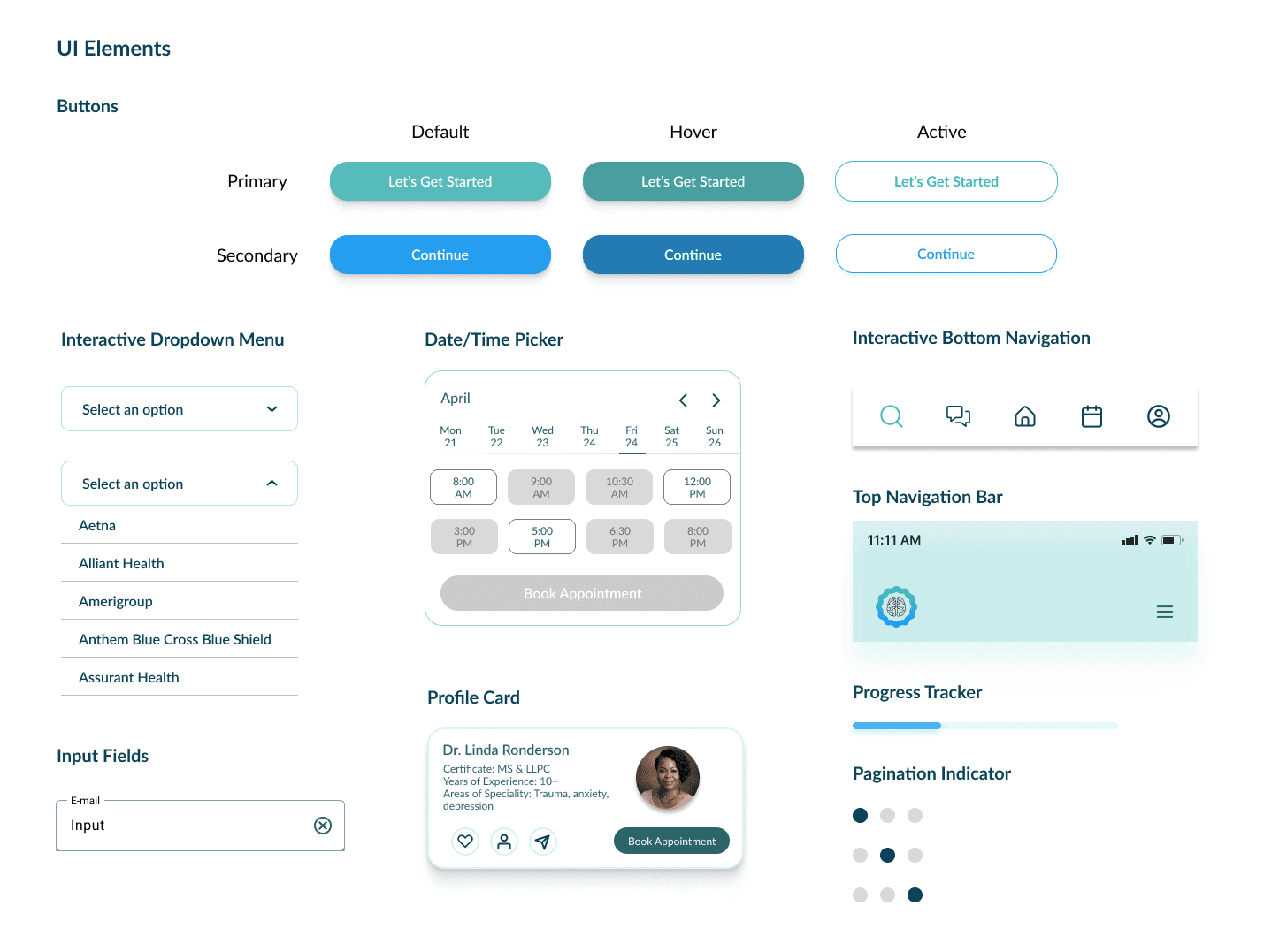
I wanted to make the UI as calming and reassuring as possible for the user. I incorporated colors, images, illustrations, and UI elements that reflected a safe space for anyone visiting the app. Having a cool color palette and non-alarming imagery was vital to help gain the trust of the user.
I wanted to make the UI as calming and reassuring as possible for the user. I incorporated colors, images, illustrations, and UI elements that reflected a safe space for anyone visiting the app. Having a cool color palette and non-alarming imagery was vital to help gain the trust of the user.
Does it work?
I conducted moderated, in person usability testing on 10 participants
Objectives-
1. We will evaluate the ease and clarity of the sign up/assessment process.
2. Measure the intuitiveness and efficiency of the search feature to browse and find a therapist fit to the participants needs.
3. Evaluate the steps required to book an appointment. Assess the ease of setting up an appointment, booking a date/time slot, and confirming details.
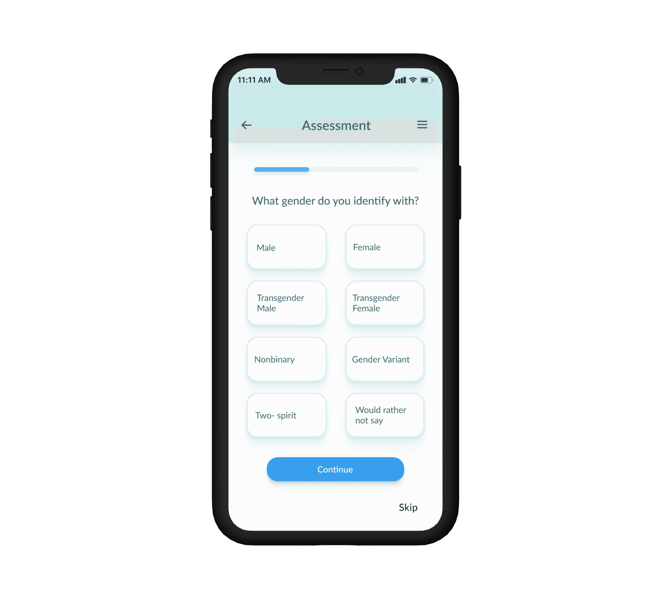
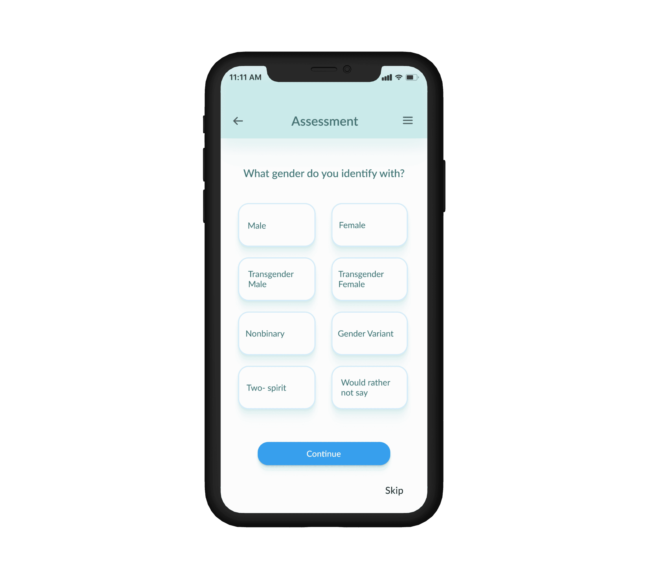
Issue 1:
5 out of 10 of the participants indicated they wanted to see how much longer the assessment would take during the sign-up process.
Suggestion:
Add a progress bar to the sign up assessment.
Before
After
Issue 2:
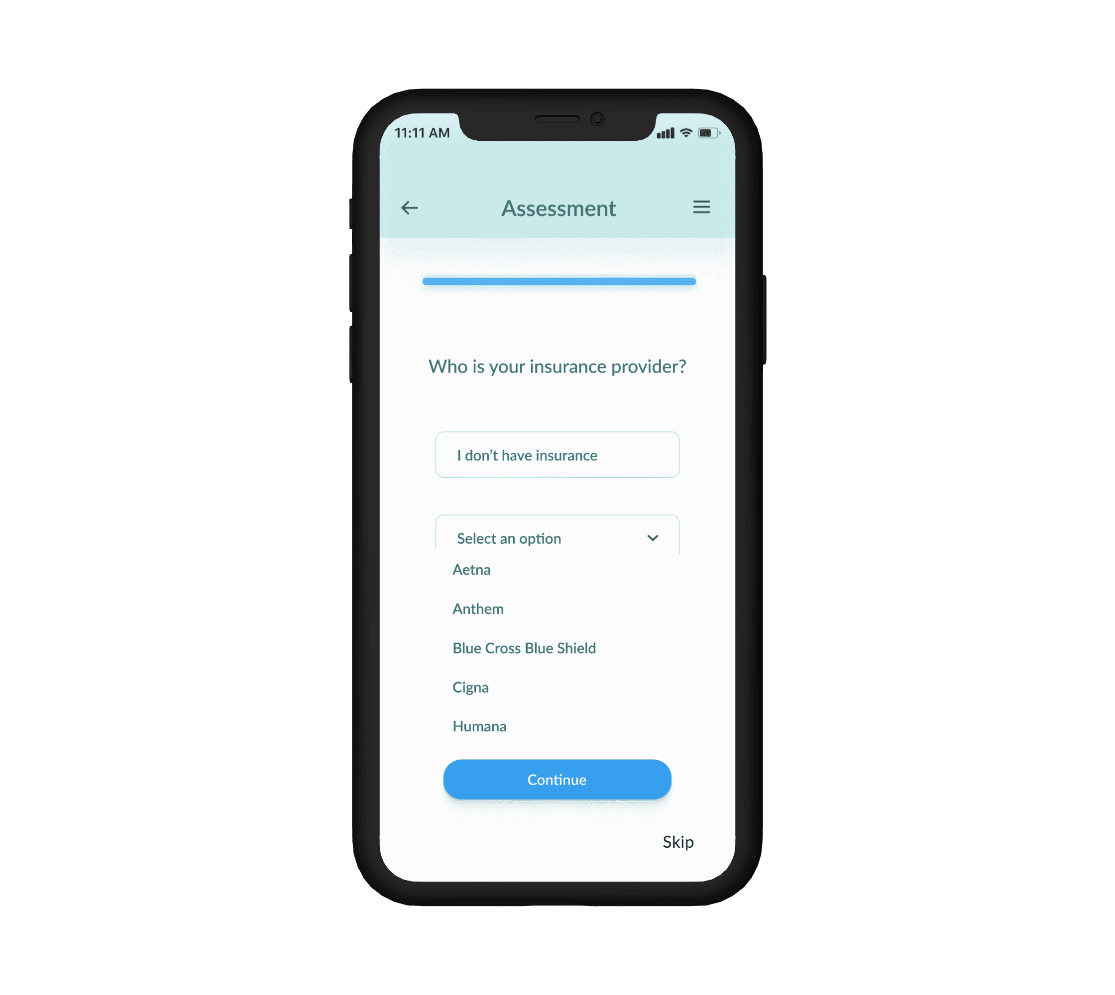
7 out of 10 participants were confused on why no options showed up when they went to answer insurance question.
Suggestion:
Add a responsive dropdown menu for picking insurance company.
Before
After
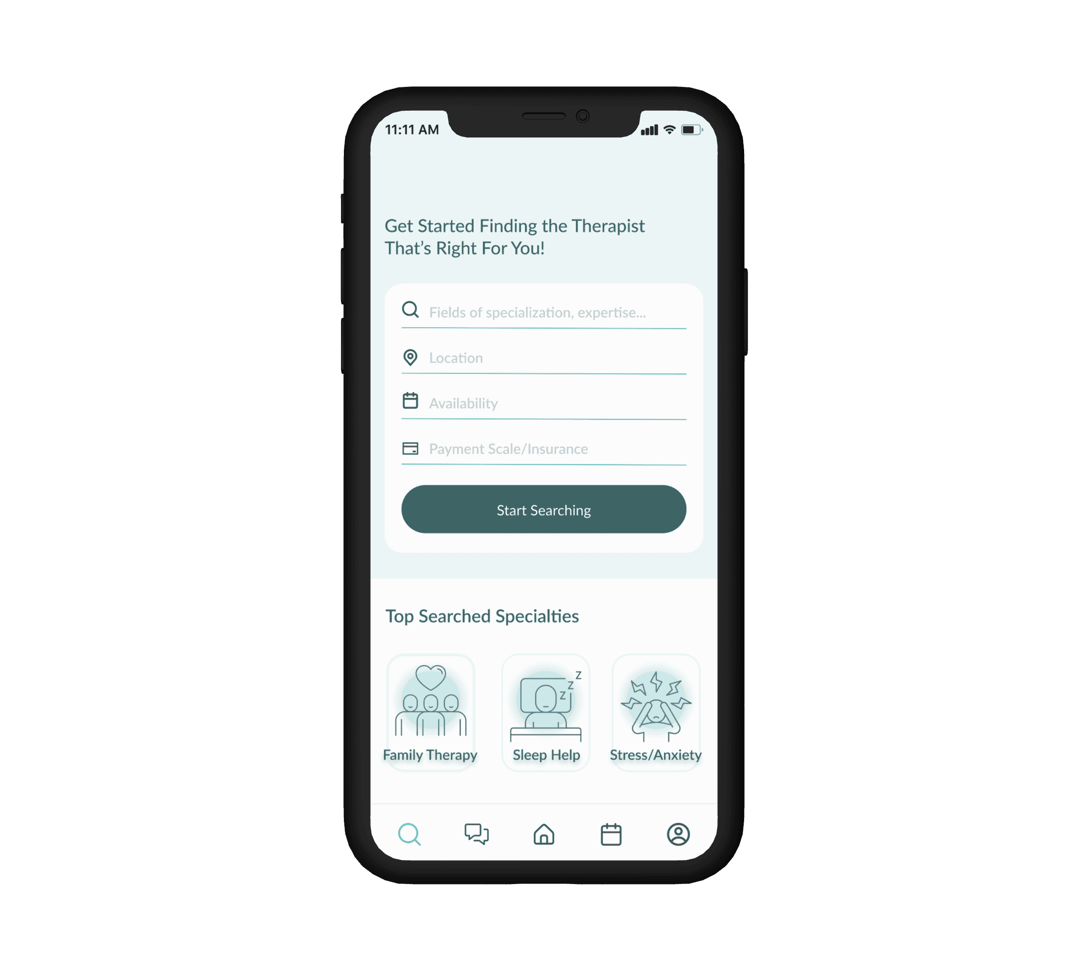
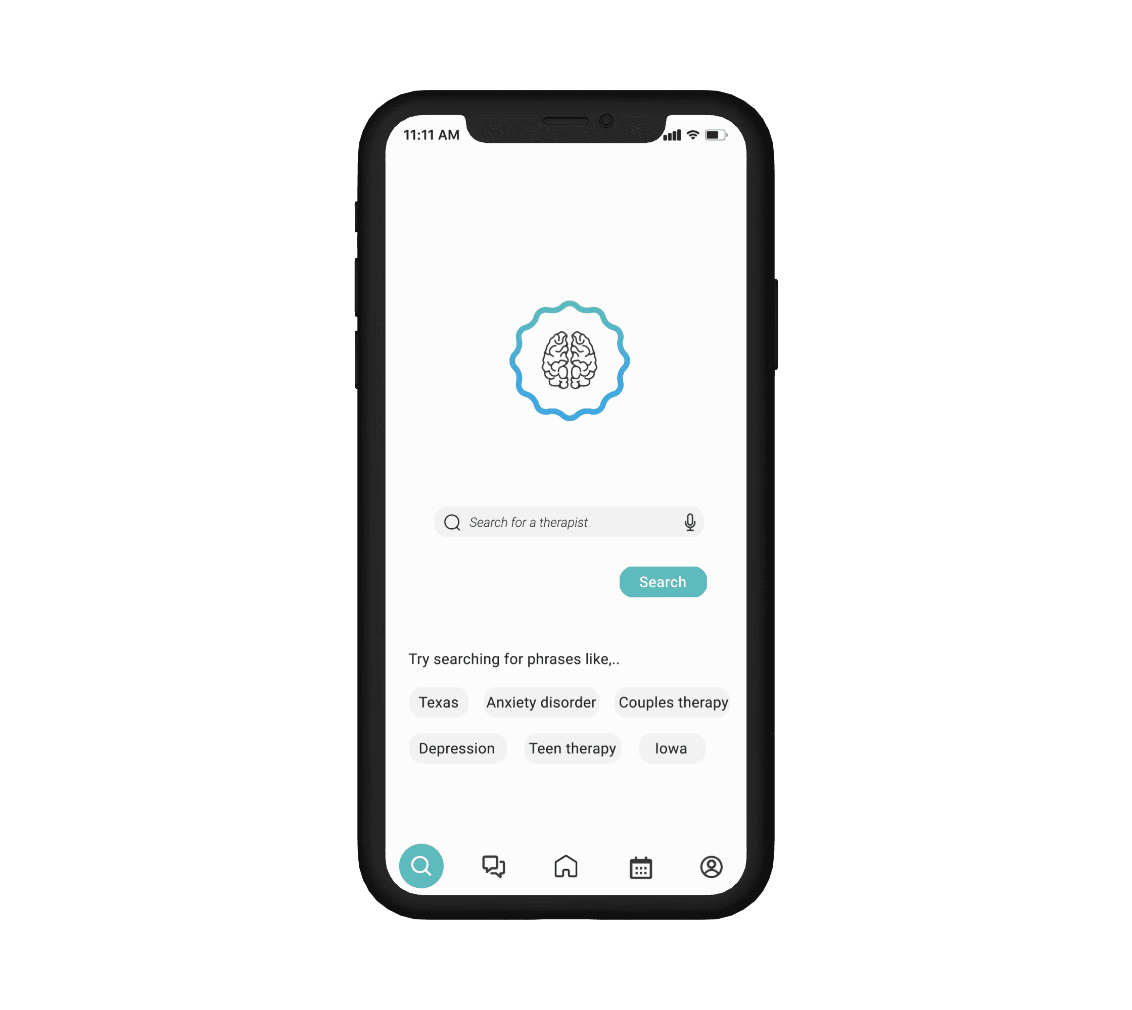
Issue 3:
8 out of 10 participants did not find the search feature to be intuitive- there was confusion on what to type in to find what they were looking for.
Suggestion:
I replaced the search bar with a series of questions to keep from overloading users
Before
After
Issue 4:
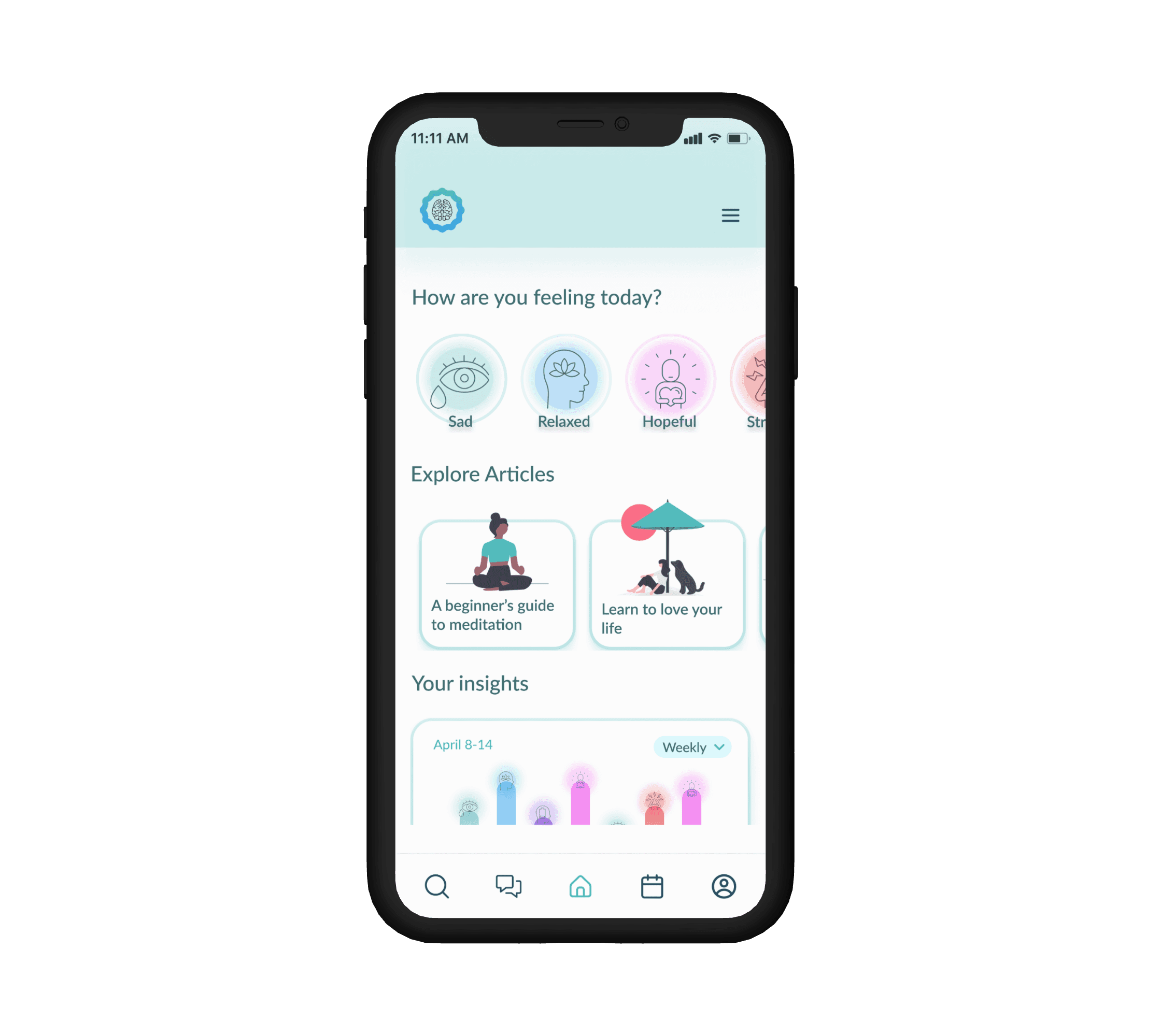
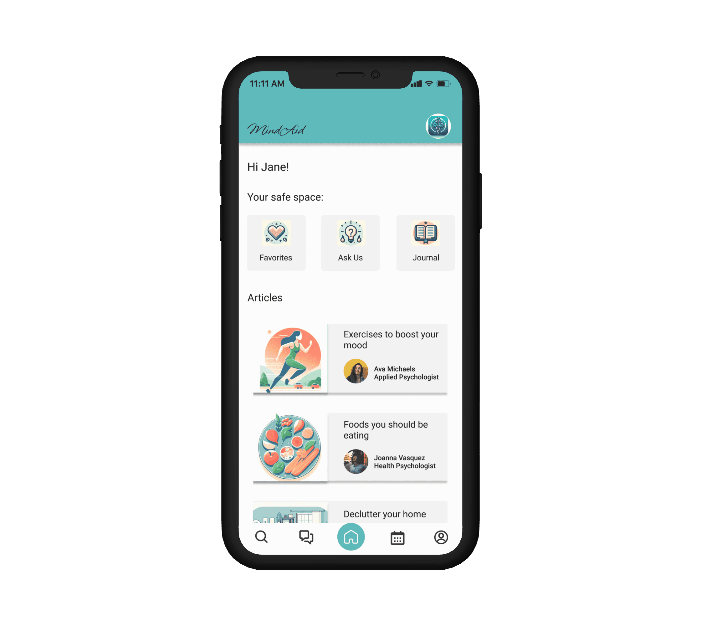
This was one I wanted to work on after I looked over my HMW statements- adding a way for users to track their progress with how they were doing in the app.
Suggestion:
Adding a chart for daily log activity to home screen to track moods
Before
After
Issue 1:
5 out of 10 of the participants indicated they wanted to see how much longer the assessment would take during the sign-up process.
Suggestion:
Add a progress bar to the sign up assessment.
Before
After


Issue 2:
7 out of 10 participants were confused on why no options showed up when they went to answer insurance question.
Suggestion:
Add a responsive dropdown menu for picking insurance company.
Before
After


Issue 3:
8 out of 10 participants did not find the search feature to be intuitive- there was confusion on what to type in to find what they were looking for.
Suggestion:
I replaced the search bar with a series of questions to keep from overloading users
Before
After


Issue 4:
This was one I wanted to work on after I looked over my HMW statements- adding a way for users to track their progress with how they were doing in the app.
Suggestion:
Adding a chart for daily log activity to home screen to track moods
Before
After


Completing this case study for the MindAid app made me realize how crucial it is to receive and apply user feedback, whether it's positive or negative. This insight was invaluable when I was designing the Hi-Fi screens and conducting user interviews, as it helped me shift my focus toward what users actually need rather than focusing on my own assumptions of what the app should look like.
One of the biggest realizations I had during this journey was to not spend focus heavily on perfection from the beginning. As designers, it’s inevitable that we’ll miss something crucial along the way, and the key is to embrace failure and refine the design as we more forward. Keep moving forward!!
That being said- I want to continue working on additional features to help encourage and track users' behaviors within the app. Maybe adding a way for users to upload their own thoughts and journal about any revelations the app has helped them recognize.
Key Takeaways/Final Thoughts:
Key Takeaways/Final Thoughts:
Thanks for Taking the Time to Read My Case Study!!
Thanks for Taking the Time
to Read My Case Study!!
Questions or comments? Reach me at @ahalmahalilovic.com
Questions or comments?
Reach me at @ahalmahalilovic.com
